By default, the purchase link templates are set up as plain URLs. But these can be changed to use images instead.
Step 1: Find and download your retail site images.
First you need to visit each of your retail sites and download their logos so you can use them as buttons. For example, here’s a link to a page containing Amazon logos for download: https://www.amazon.com/gp/help/customer/display.html?ie=UTF8&nodeId=201713630
Step 2: Upload your images to the WordPress media library.
Login to WordPress and go to Media > Add New. Upload each retail image you downloaded.
Once they’ve been uploaded, you need to copy the link for the image. This part and the following step (step 3) will need to be done for each image.
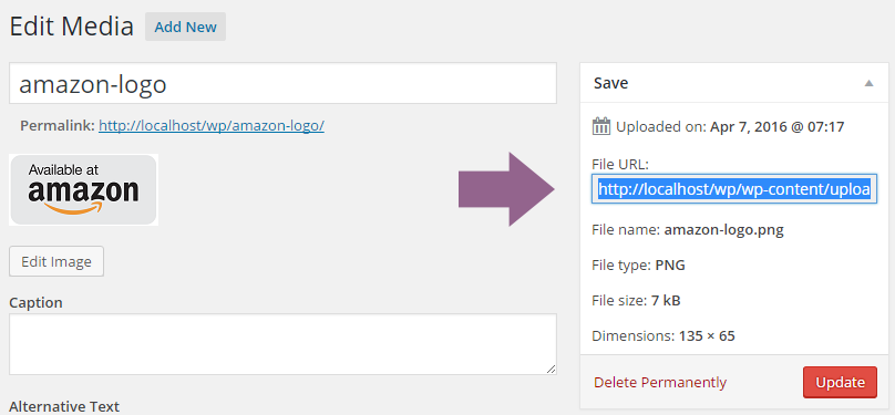
Click “Edit” to open up the media page, find the “File URL” on the right, and copy that.

Step 3: Add the image to your template.
Once you have the URL copied, go to Books > Settings and in the “Book Layout” tab, click on “Purchase Links”.
In the Retail Outlets table, find the template associated with this store’s logo. By default it will look a bit like this:
<a href="[link]" target="_blank">Amazon</a>
Delete the text “Amazon” and enter this in its place:
<img src="YOUR IMAGE URL HERE" alt="Amazon">
Be sure to paste in your image URL where I’ve noted. You can also change the alt text to a different store name if you’re using a different retail site.
In the end, your final template should look similar to this:
<a href="[link]" target="_blank"><img src="http://localhost/wp/wp-content/uploads/2016/04/amazon-logo.png" alt="Amazon"></a>
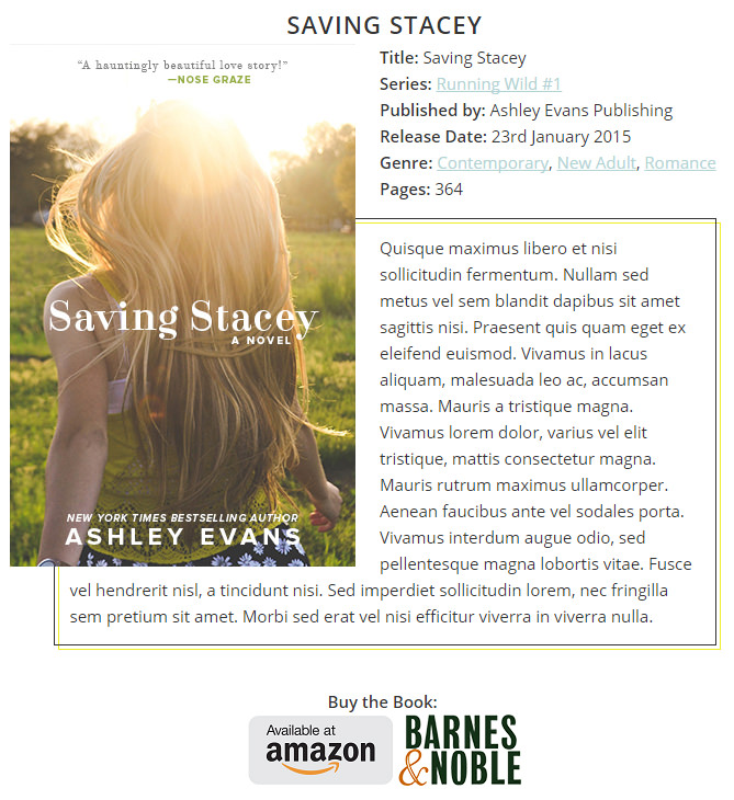
Here’s how my final book page looks:

To get this effect, I put an empty space in the “Separator” setting field.
Then on the “Book Layout” page, my purchase links template looks like this:
<div style="text-align: center;"><strong>Buy the Book:</strong> <br> [purchaselinks]</div>
If you’re familiar with CSS it would be better to add a class name to the <div> tag instead (like <div class="text-center">), but this is just an example.
